Processing PAMGuard Data Files
Introduction
Various modules in PAMGuard produce binary files. Custom libraries written in MATLAB, R and Python exist to help you further process these files. In this tutorial, we will process a folder of Click Detector binary files, count clicks in a binary file, plot Whistle and Moan Detector contours and a long term spectral average, demonstrating just a small fraction of what can done with these libraries.
These tutorials were tested with the latest version of PAMGuard, V2.2.17, and the latest versions of the MATLAB, R and Python interfaces We offer no guarantee that they will work with earlier versions.
If you have older binary files, the latest PAMGuard release can update them to the latest version.
This tutorial uses example path names from both Windows and macOS/Linux. Make sure you alter path names accordingly for all exercises
Instructions for installing software
- Go to GitHub Releases
- Download the latest
pgmatlab-{version}.zipfile - Extract the ZIP file to your desired location
- Add the extracted
pgmatlabfolder to your MATLAB path:
addpath('path/to/extracted/pgmatlab');You only need to add the one pgmatlab folder to your path to use the main PAMGuard binary file functions. However, if you’re using any of the utility and database functions directly within your own code, you’ll need to either import the namespaces, import individual functions from within the namespaces, or put the full namespace path in every function call:
import pgmatlab.utils.*; % import PAMGuard utils functions
import pgmatlab.db.*; % import PAMGuard database functions
To get started with R and PAMGuard you must first install the PAMBinaries package. Start RStudio and go to Tools -> Install Packages. In the dialog that appears type PamBinaries and click Install. R is now setup to read PAMGuard binary files!
 .
.
The R library is near enough a carbon copy of the MATLAB library so the functions are all the same but the basic “syntax” is different but remember to import the library at the start of your script.
library(PamBinaries)To install the Python library simply install pypamguard via pip in your Python IDE.
pip install pypamguardThen make sure to import the library at the top of your script.
import pypamguardData to use with this tutorial
All data used in this tutorial can be downloaded from Zenodo at https://doi.org/10.5281/zenodo.17697843. Once you’ve downloaded the zip file, unzip it and put the files somewhere convenient on your computer. In each tutorial, we reference the files and folders you’ve downloaded as /enter/your/path/…, which you should of course replace with the path to the files on your computer.
As always, we encourage you to also take a look at your own data files.
Exercise 1: Open a Click Detector Binary File
For the first exercise of this tutorial, you will open a click detector binary file from the folder Data/porpoise_data/Binary/20130710/. This contains 24 files: twelve data files (.pgdf) and twelve index files (.pgdx). You will concern yourself solely with the twelve data files (.pgdf). Select one of these files which you will open and process; then follow the instructions for your preferred programming language below.
Below, we use loadPamguardBinaryFile() to load the click file into a data array clicks and metadata object fileInfo. The clicks variable is an array of data elements (clicks) in the binary file.
To access elements from an array in MATLAB you must use curved brackets starting at index one (1), unlike most languages which use square brackets from index zero [0].
import pgmatlab.*;

[clicks, fileInfo] = pgmatlab.loadPamguardBinaryFile("\enter\your\path\porpoise_data\PAMBinary\20130710\Click_Detector_Click_Detector_Clicks_20130710_142512.pgdf")

% get and print the first click
firstClick = clicks(1)
disp(firstClick)

% get and print startSample of the first click
firstClickStartSample = clicks(1).startSample
disp(firstClickStartSample)
To check that the file you have loaded is correctly a click detector you can access the file
In R, we use loadPamguardBinaryFile() to load all contents of the processed data file into a single clickFile object. The clickFile$data attribute produces an array of data elements (clicks) in the binary file.
library(PamBinaries)

clickFile <- loadPamguardBinaryFile("\enter\your\path\porpoise_data\PAMBinary\20130710\Click_Detector_Click_Detector_Clicks_20130710_142512.pgdf")
clicks = clickFile$data

# get the first click
firstClick <- clicks[[1]]
print(firstClick)

# get startSample of the first click
firstClickStartSample <- clicks[[1]]$startSample
print(firstClickStartSample)
In Python we use load_pamguard_binary_file() to load all contents of the processed data file into a single click_file object. The click_file.data attribute produces an array of all data elements (clicks) in the binary file.
In Python we use snake_case rather than camelCase (as used in MATLAB and R) to write out phrases such as variable and method names.
from pypamguard import load_pamguard_binary_file

click_file = load_pamguard_binary_file("\enter\your\path\porpoise_data\PAMBinary\20130710\Click_Detector_Click_Detector_Clicks_20130710_142512.pgdf")
clicks = click__file.data

// get the first click
first_click = clicks[0]
print(first_click)

// get startSample of the first click
first_click_start_sample = clicks[0].start_sample
print(first_click_start_sample)
Exercise 2: Plotting Waveform Data
Now that we have loaded in the data files into a more workable data structure, we will plot the the waveform data of the first click. You can build off of the code from exercise 1.
Depending on how you set-up PAMGuard, the exact plots shown in this tutorial may not match those that you produce yourself. So long as you understand what the code is doing, this is not a problem.
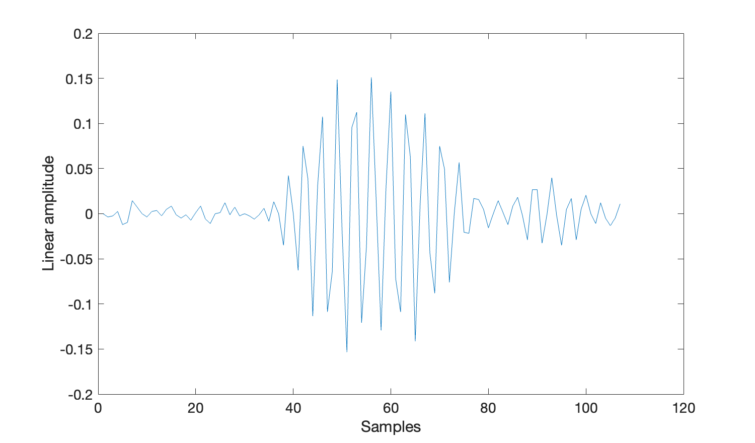
MATLAB has an in-built method plot() that simplifies plotting the waveform data.
%Get the 28th click - note that MATLAB counts from one
waveFormData=clicks(28).wave;
plot(waveFormData)
xlabel('Samples')
ylabel('Linear amplitude')
set(gca, 'FontSize', 14)
Note that there may be more than one waveform in single click detection. This is because channels within the click detector can be grouped together. e.g. for a typical towed array survey where the two hydrophone elements within the towed array are close together, those two channels will be grouped- hence a single click detection would have two sets of waveform information, one for channel 0 and one for channel 1.
R has an in-built method plot() that simplifies plotting the waveform data. We need to create the x-axis manually by creating an array of integers x from 1 to the length of the waveform data. The use of the index [,1] cuts down a potential multi-channel waveform into a single-channel waveform of the lowest channel number.
#Get the 28th click - note that R counts from one
aclick = clicks[[28]];
wave =  aclick$wave[,1]
x <-1:length(aclick$wave[,1])
plot(x, aclick$wave[,1], type = "l", lty = 1, col="red")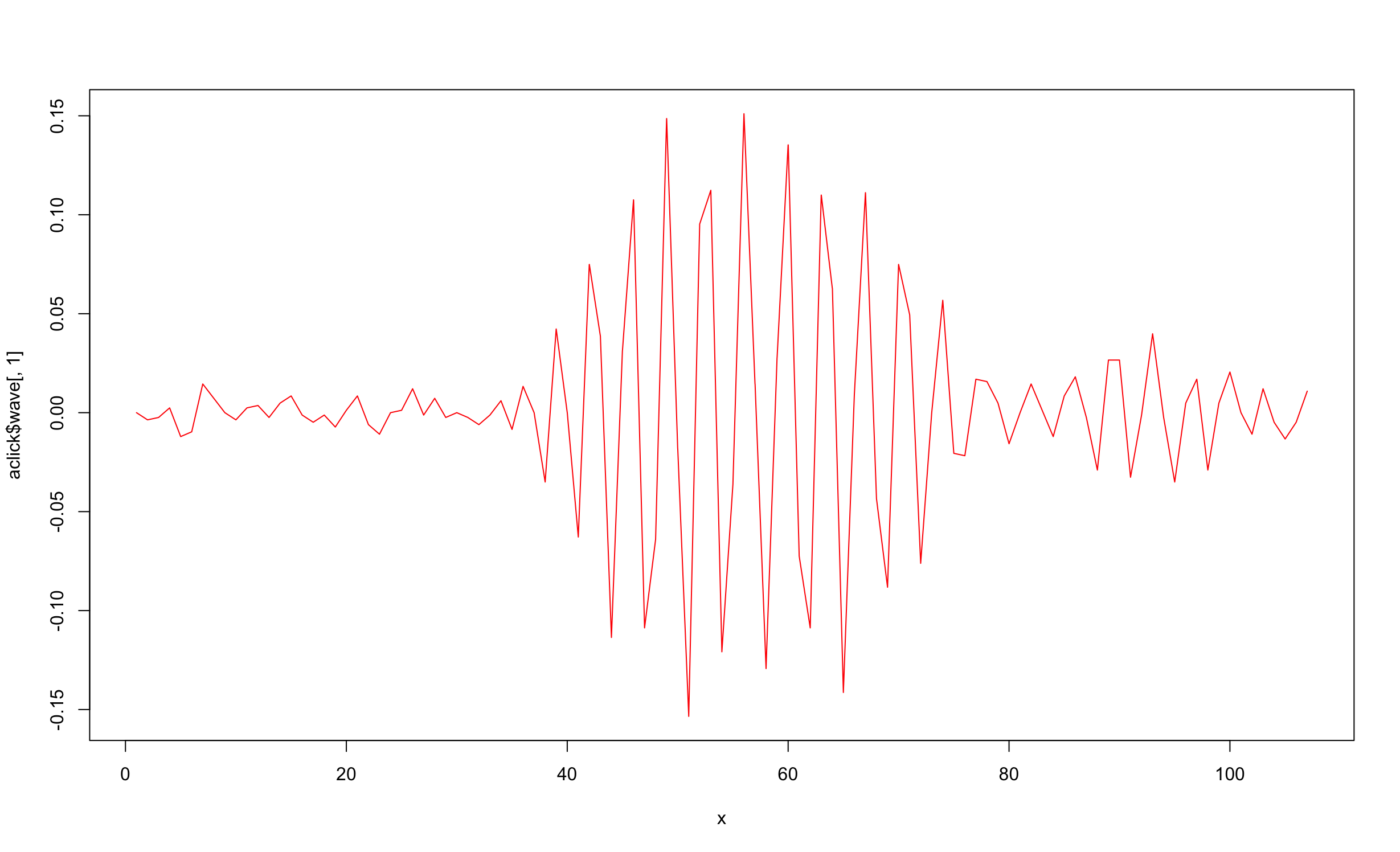
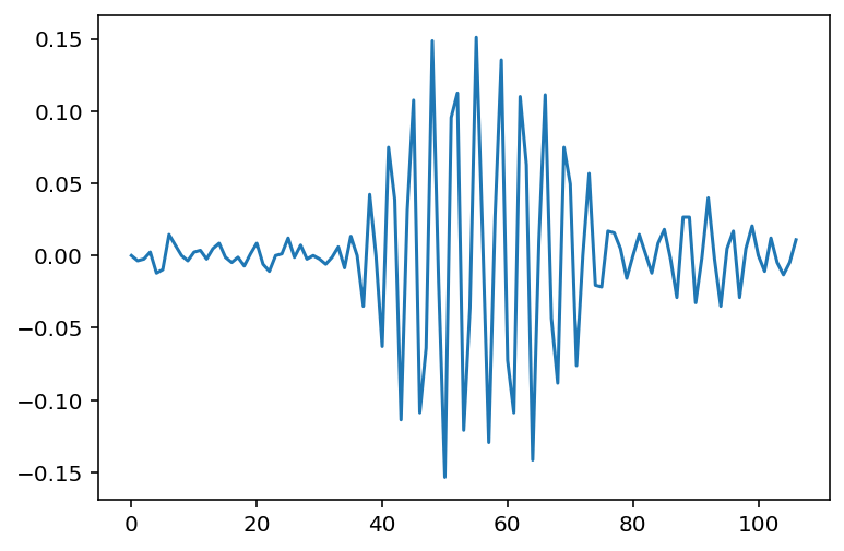
In Python the matplotlib library is required to plot data. The code below will plot all the waveform data from the first channel.
Import matplotlib using pip install matplotlib in the command line / terminal. If you do not have matplotlib installed the following code will not work for you.
import matplotlib.pyplot as plt
# code from previous exercise goes here
#Get the 28th click - note that Python counts from zero so the index is 27
plt.plot(clicks[27].wave[0])
plt.savefig('plot.png')
The code above will have saved the plot in a PNG file plot.png within your current working directory.
The code above plots the first channel from the waveform data of the click. A click may have one or more channels (clicks[0].wave is a 2-dimensional array, as such). You can write a for-loop, as shown below, to plot all the separate channels together. In the event that the click only has one channel, both code snippets shown in this exercise achieve the exact same thing.
import matplotlib.pyplot as plt
# code from previous exercise goes here
for chan in clicks[28].wave:
    plt.plot(chan)
plt.savefig('plot.png')
Exercise 3: Load a Folder of Click Files and Count the Classified Clicks
So far, we have opened one of the twelve click files. In reality we want to deal with any number of files in a folder. In this exercise, we will read all twelve binary files at once and count the number of classified clicks.
clicks[0] is considered a classified click when clicks[0].type == 1.
Method 1: loading files individually into memory (recommended)
First, create an array of the files within your desired folder. The folder that you should load is the same of that which contained the click file in exercise 1. When we use the fullfile() method we pass in a file name mask *.pgdf to filter the files to only those with a .pgdf extension.
folderName = '\enter\your\path\porpoise_data\PAMBinary\20130710\';
binaryFiles = dir(fullfile(folderName, '*.pgdf'));The variable binaryFiles is an array of MATLAB structures, each of which contains information about a file in the folder. This allows us to open up the files one-at-a-time to prevent excessive memory usage.
Now we must create a for loop to go through each of the files in binaryFiles, and load them in using loadPamguardBinaryFile() (as in exercises 1 and 2).
for i = 1:length(binaryFiles)
    filePath = fullfile(folderName, binaryFiles(i).name);
    clicks = pgmatlab.loadPamguardBinaryFile(filePath);
end
This code achieves very little. Each time we load one of the files, it is almost immediately dumped from memory as the loop enters its next iteration - no useful information is produced.
Now we will use a nested loop to count the number of porpoise clicks there exist in all twelve data files in the folder. We use a technique called nested looping here to increment a global counter. The outer loop (where i is incremented) goes through all the files, and the inner loop (where j is incremented) goes through all the clicks in each file to check whether they are classified or not.
count = 0;
for i = 1:length(binaryFiles)
    filePath = fullfile(folderName, binaryFiles(i).name);
    clicks = pgmatlab.loadPamguardBinaryFile(filePath);
    for j = 1:length(clicks)
        if (clicks(j).type == 1)
            count = count + 1;
        end
    end
    fprintf('Porpoise click count after %d files is %d\n', i, count);
end
First, create an array of the files within your desired folder. The folder that you should load is the same of that which contained the click file in exercise 1. We use the in-built method list.files() with a pattern \\.pgdf$ to mask the files.
folderName = '\enter\your\path\porpoise_data\PAMBinary\20130710\';
fileNames <- list.files(folderName, pattern = "\\.pgdf$")The variable fileNames is an array of file names (as strings). This allows us to open up the files one-at-a-time to prevent excessive memory usage. Note that you can use
for (val in fnames) {
  print(val)
}
to print all the file names
Now we must create a for-loop to go through each of the files represented by file names in fileNames, and load them in using loadPamguardBinaryFile() (as in exercises 1 and 2).
for (filename in fnames) {
    # load each click file.
    clicks <- loadPamguardBinaryFile(file.path(folder, filename));
}
This code achieves very little. Each time we load one of the files, it is almost immediately dumped from memory as the loop enters its next iteration - no useful information is produced.
Now we will use a nested loop to count the number of porpoise clicks there exist in all twelve data files in the folder. We use a technique called nested looping here to increment a global counter. The outer loop goes through all the files, and the inner loop goes through all the clicks in each file to check whether they are classified or not.
count = 0;
for (filename in fnames) {
  # load each click file.
  clicks <- loadPamguardBinaryFile(file.path(folder, filename));
  # iterate through the click files to count the classified clicks.
  for (click in clicks$data) {
    if (click$type == 1) {
      count = count + 1;
    }
  }
}
First, create an array of the files within your desired folder. The folder that you should load is the same of that which contained the click file in exercise 1. We use the native Python library pathlib to list all files within a folder (using the Path class), and mark them using the mask *.pgdf.
import pathlib, pypamguard
folder_name = '\enter\your\path\porpoise_data\PAMBinary\20130710\'
file_names = pathlib.Path(folder_name).glob('*.pgdf')The variable file_names is an array of file names (as strings). This allows us to open up the files one-at-a-time to prevent excessive memory usage.
Now we must create a for-loop to go through each of the files in file_names, and load them in using load_pamguard_binary_file() (as in exercises 1 and 2).
# code to create file_names variable goes here
for file_name in file_names:
    clicks = pypamguard.load_pamguard_binary_file(pathlib.Path(file_name))
This code achieves very little. Each time we load one of the files, it is almost immediately dumped from memory as the loop enters its next iteration - no useful information is produced.
Now we will use a nested loop to count the number of porpoise clicks there exist in all twelve data files in the folder. We use a technique called nested looping here to increment a global counter. The outer loop goes through all the files, and the inner loop goes through all the clicks in each file to check whether they are classified or not.
# code to create file_names variable goes here
count = 0;
for file_name in file_names:
    clicks = pypamguard.load_pamguard_binary_file(pathlib.Path(file_name))
    for click in clicks.data:
        if click.type == 1:
            count += 1;
Method 2: loading all data into memory at once (memory intensive)
Each library has a function you can use to load all the files in a folder into memory at once. This can offer simplicity with respect to the nested loops you wrote above as you would no longer be responsible for looping through the individual files in the folder you wish to read.
The method to load all files in the folder into memory at once places a heavy burden on your computer’s memory. Only use this function if you are processing a small number of files, or are pre-filtering them significantly (we do not cover that in this tutorial).
folderName = '/enter/your/path/porpoise_data/PAMBinary/20130710';
clicksAll = pgmatlab.loadPamguardBinaryFolder(folderName, "Click_Detector_Click_Detector_Clicks_*.pgdf");
count = 0;
for i = 1:length(clicksAll)
    if (clicksAll(i).type == 1)
        count = count + 1;
    end
end
R has no function to load all files in a folder at once. You should use for loops as described above.
import pypamguard
folder_name = '/enter/your/path/porpoise_data/Binary/20130710'
clicks_all = pypamguard.load_pamguard_binary_folder(folder_name)
count = 0
for click in clicks_all.data:
    if click.type == 1:
        count += 1
Exercise 4: Loading Whistle Files
In this exercise we will open another type of file: the whistle file. This differs from click data as it is produced by the PAMGuard Whistle and Moan Detector. It will become quite obvious the similarities and differences between the click detector and whistle files.
PAMGuard has a large number of modules. Each module produces different kinds of data, each of which can be read into the R, MATLAB or Python libraries for reading PAMGuard data files. This tutorial, which concerns the Click Detector and Whistle and Moan Detector, only scratches the surface of what PAMGuard, and these data file readers are capable of.
You will open the file stored at /enter/your/path/whistle_data/PAMBinary/20190403/WhistlesMoans_Whistle_and_Moan_Detector_Contours_20190403_133052.pgdf in your preferred programming language. Depending on the working directory of your terminal or editor, you may need to adjust the relative path of the data file.
import pgmatlab.*;
fileName = '/enter/your/path/whistle_data/PAMBinary/20190403/WhistlesMoans_Whistle_and_Moan_Detector_Contours_20190403_133052.pgdf';
[data, fileInfo] = pgmatlab.loadPamguardBinaryFile(fileName);
The data struct produced by the code above will contain at least the following attributes. Please familiarise yourself with them, before continuing on to the next section.
| MATLAB | Meaning |
|---|---|
millis |
The start time of the whistle in milliseconds. |
startSample |
The first sample of the whistle often used for finer-scale time delay measurements. |
uid |
A unique identifier for the whistle. |
channelMap |
The channel map for this whistle (one integer, made up of 32 bits, where each bit has a value 0 or 1 specifying the existence of that channel in the contour. |
nSlices |
The number of slices the whistle’s contour is created from. |
amplitude |
The amplitude of the whistle. |
sliceData |
An array of contour slices, with each slice
|
contour |
An array of the same length as sliceData where each element contour(x) is the first frequency peak which defines the contour (sliceData(x).peakData(2,1)). |
contWidth |
An array of the same length as sliceData where each element contWidth(x) is the width of the first frequency peak in that contour slice (sliceData(x).peakData(3,1)-sliceData(x).peakData(1,1)). |
library(PamBinaries)
binaryFile <- loadPamguardBinaryFile("/enter/your/path/whistle_data/PAMBinary/20190403/WhistlesMoans_Whistle_and_Moan_Detector_Contours_20190403_133052.pgdf")
data = binaryFile$data
The data variable produced by the code above will contain at least the following attributes. Please familiarise yourself with them, before continuing on to the next section.
| R | Meaning |
|---|---|
millis |
The start time of the whistle in milliseconds. |
startSample |
The first sample of the whistle often used for finer-scale time delay measurements. |
uid |
A unique identifier for the whistle. |
channelMap |
The channel map for this whistle (one integer, made up of 32 bits, where each bit has a value 0 or 1 specifying the existence of that channel in the contour. |
nSlices |
The number of slices the whistle’s contour is created from. |
amplitude |
The amplitude of the whistle. |
minFreq |
The minimum frequency of the contour in Hz |
maxFreq |
The maximum frequency of the contour in Hz |
sliceData |
An array of contour slices, with each slice x containing: | | - sliceData[x]$sliceNumber: book-keeping; | | - sliceData[x]$nPeaks: number of peaks; | | - sliceData[x]$peakData: peak data; | |
contour |
An array of the same length as sliceData where each element contour(x) is the first frequency peak which defines the contour (sliceData[x]$peakData[0][1]). | |
contWidth |
An array of the same length as sliceData where each element contWidth(x) is the width of the first frequency peak in that contour slice (sliceData(x)$peakData[0][2]-sliceData(x)$peakData[0][0]). | |
import pypamguard
binaryFile = pypamguard.load_pamguard_binary_file("/enter/your/path/whistle_data/PAMBinary/20190403/WhistlesMoans_Whistle_and_Moan_Detector_Contours_20190403_133052.pgdf")
data = binaryFile.data
The data variable produced by the code above will contain at least the following attributes. Please familiarise yourself with them, before continuing on to the next section.
| Python | Meaning |
|---|---|
millis |
The start time of the whistle in milliseconds. |
start_sample |
The first sample of the whistle often used for finer-scale time delay measurements. |
uid |
A unique identifier for the whistle. |
channel_map |
The channel map for this whistle (one integer, made up of 32 bits, where each bit has a value 0 or 1 specifying the existence of that channel in the contour. |
n_slices |
The number of slices the whistle’s contour is created from. |
amplitude |
The amplitude of the whistle. |
slice_numbers |
An array of numbers: each element slice_numbers[x] containing a book-keeping number for a slice. |
n_peaks |
A parallel array to slice_numbers, each element n_peaks[x] containing the number of peaks in that slice. |
peak_data |
A parallel array to slice_numbers, each element peak_data[x] containing a sub-array of peak frequency-related data for that slice. |
contour |
A parallel array to slice_numbers, each element contour[x] containing the peak frequency of that slice (peak_data[x][1]). |
cont_width |
A parallel array to slice_numbers, each element slice_numbers[x] containing the frequency width of that slice (peak_data[x][2] - peak_data[x][0]). |
Exercise 5: Plotting Whistle Contours
We will now plot all the whistle contours on a graph with each contour starting at x = 0. This is a neat way to visualise whistle detections and shows a snapshot of the whistle distribution with frequency.
To do this, we loop through each of the whistles in data, plotting the peak frequencies from the contour attribute of each struct.
We use user-defined sampleRate and fftLength variables to calculate the true frequency of each peak frequency data point in the contour.
The hold on; and hold off; statements provide a way to plot a lot of data on the same plot.
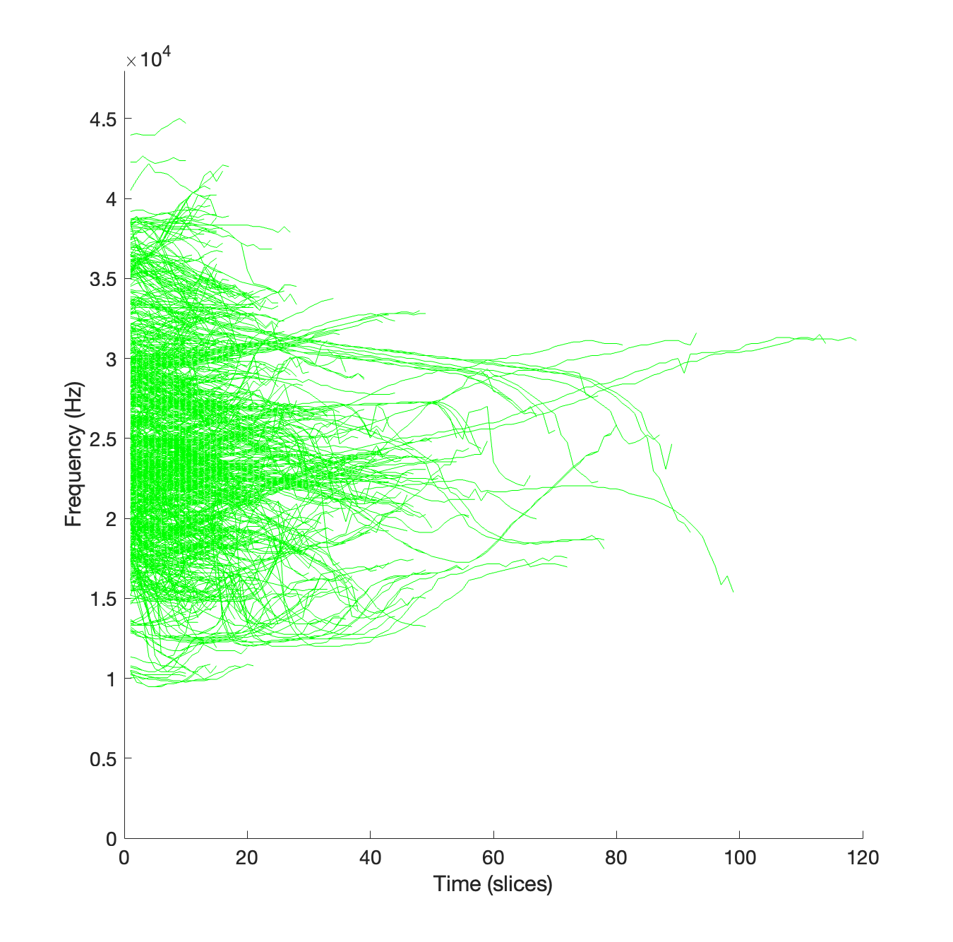
%% Exercise 5
figure
% Code from the previous exercise goes here
sampleRate = 96000;
fftLength = 1024;
hold on;
for i = 1:min([length(data) 1000])
    contour = data(i).contour * sampleRate / fftLength;
    myplot(i) = plot(contour, 'g', 'LineWidth', 0.5);
    disp(['Plotting whislte ' num2str(i) ' of ' num2str(length(data))])
end
ylim([0,48000]);
hold off;
xlabel('Time (slices)')
ylabel('Frequency (Hz)')
set(gca, 'FontSize', 14)
Execution of this code should produce a graph that looks something like this.
To do this, we loop through each of the whistles in the data variable, plotting the peak frequencies from the contour attribute of each object.
We use user-defined samplerate and fftlength variables to calculate the true frequency of each peak frequency data point in the contour.
samplerate=96000;
fftlength=1024;
#library for line transparency
library(scales)
#define sample rate and fft length in samples
samplerate=96000;
fftlength=1024;
# create an empty plot with correct frequency limits
plot(1,type = "l",xlim=c(1,120),ylim=c(0,48000), xlab='Slice no.',
ylab='Frequency (Hz)')
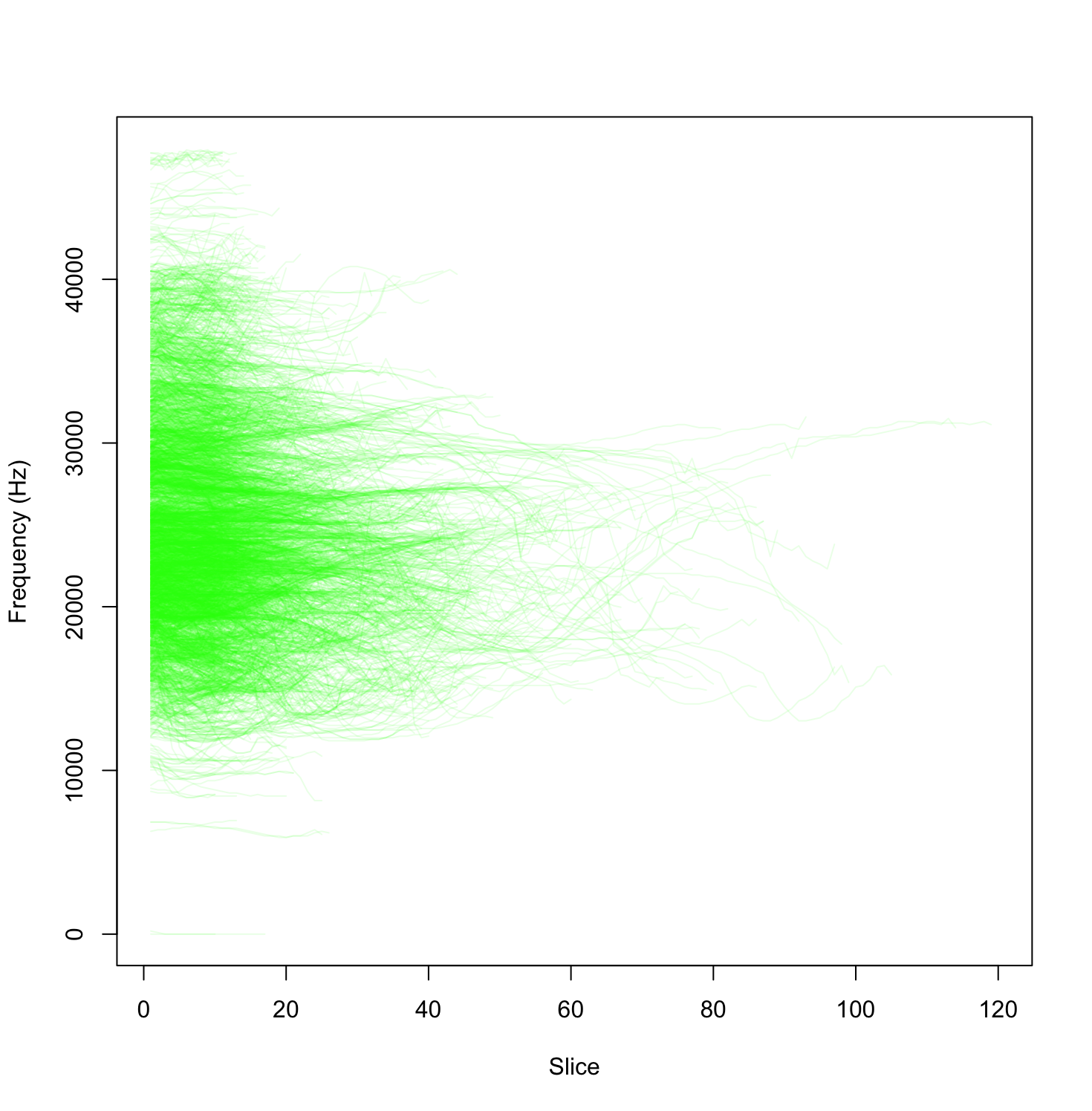
#iterate through all the contours and plot them
for (awhistle in data) {
#create an aray of slices
x <-1:length(awhistle$contour)
#extract contour and convert to units of Hz.
contour <- awhistle$contour*samplerate/fftlength;
#plot the line and make them transparent
lines(x, contour, type = "l", lty = 1, col=alpha(rgb(0,1,0), 0.1))
}Execution of this code should produce a graph that looks something like this.
To do this, we loop through each of the whistles in the data
We use user-defined sample_rate and fft_length variables to calculate the true frequency of each peak frequency data point in the contour.
import matplotlib.pyplot as plt
# Code from the previous exercise goes here
sample_rate = 96000
fft_length = 1024
plt.figure(figsize=(8, 8))
num_contours = min(len(binaryFile.data), 1000)
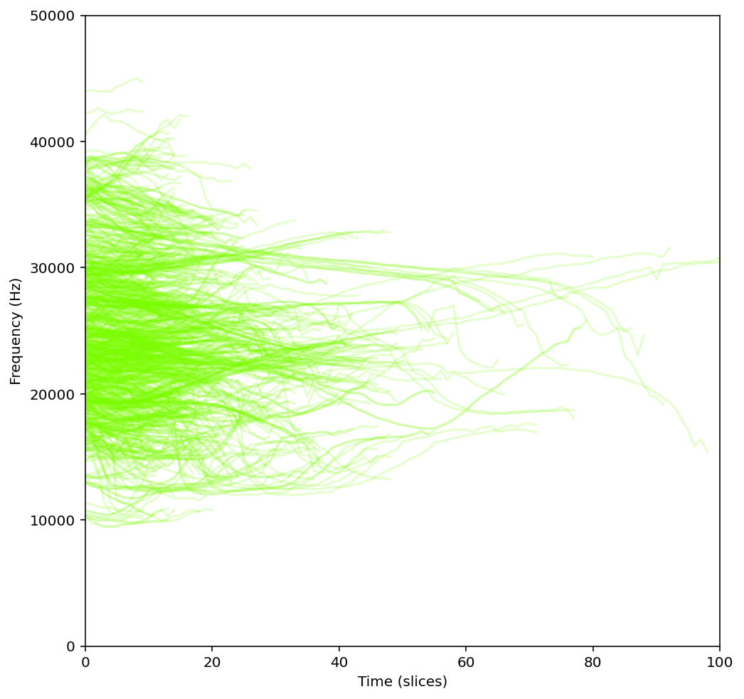
for whistle in binaryFile.data[:num_contours]:
contour = whistle.contour * (sample_rate / fft_length)
plt.plot(contour, color='lawngreen', alpha=0.2)
plt.xlabel('Time (slices)') # Set your desired x-axis label
plt.ylabel('Frequency (Hz)') # Set your desired y-axis label
plt.xlim(0, 100) # Set x-axis limits from 0 to 100 (change as needed)
plt.ylim(0, 50000) # Set y-axis limits from 0 to 50000 Hz (change as needed)
plt.show()Execution of this code should produce a graph that looks something like this.
Exercise 6: Creating a Long Term Spectral Average
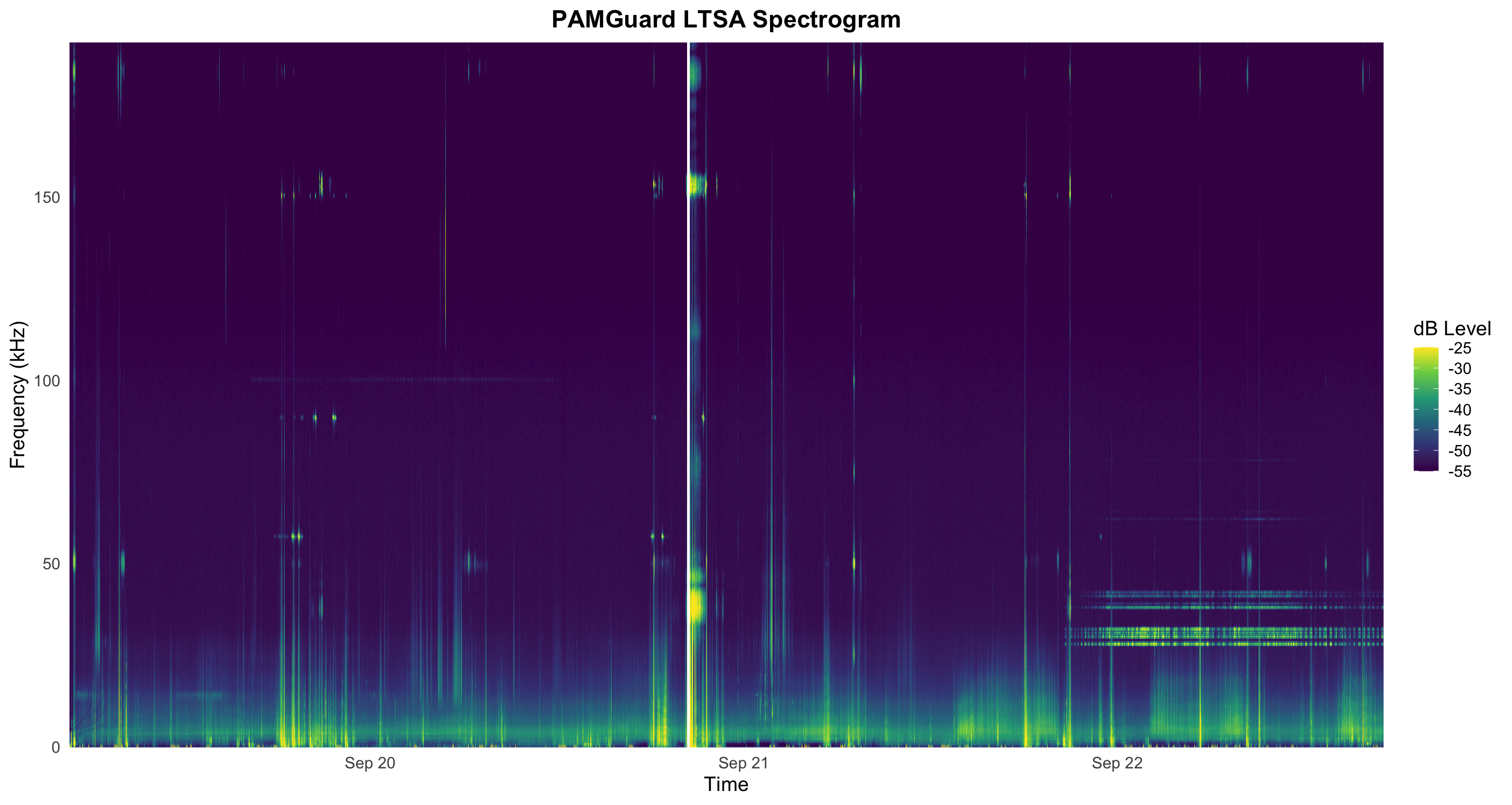
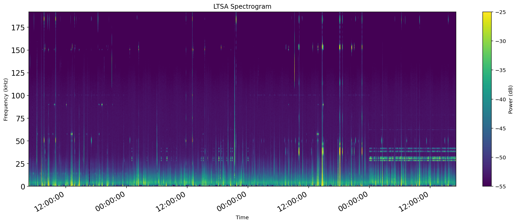
A long term spectral average (LTSA) can be very useful for getting a quick overview of long time periods of acoustic data. PAMGuard can produce an LTSA analysis, and output such data to a PAMGuard binary file.
Other tutorials on the PAMGuard website have step by step guides on how to use PAMGuard to generate long term spectral averages.
We will be working with LTSA data found in the Data/LTSA/ folder. There are multiple data files in this folder, because PAMGuard has purposely split-up data to ensure small manageable files. We will load the entire folder at once, allowing all the requested LTSA data to be plotted at once.
import pgmatlab;


%load the data with the verbose flag set
ltsa = pgmatlab.loadPamguardBinaryFolder("enter/your/path/LTSA_2/PAMBinary", "LTSA_*.pgdf", 1);
sr = 384000; %samplerate in Hz
n = 1;

ltsa_spectrum=[];
times=[];
% Run through the ltsa data and extract the data into a 2D array to plot as
% surface. Here we select every second LTSA data point as there are ~12,000
% measurements and that can be hard to plot as a surface on some computers
for i = 1 : 2 : (length(ltsa) - 1)
    if (~isempty(ltsa(i).data))
    ltsa_spectrum(:, n) = ltsa(i).data(:,1);
    times(n) = ltsa(i).date;
    n=n+1;
    end

end

% Create a surface with the correct frequency and times - plot in kHz as a
% lot easier to see.
freqbins = linspace(0, sr/1000/2, length( ltsa_spectrum(:,1)));

%Create a grid of times and frequencies.
[X, Y] = meshgrid(...
    times,...
    freqbins);

figure
% plot the surface
surf(X, Y, 20*log10(ltsa_spectrum), 'LineStyle', 'none')
view(0,90)
%set the colour limits to make the plot have correct contrast - this can be
%a bit of trial and error
clim([-55, -25]);
set(gca, 'FontSize', 14)
%show times instead of date numbers on the x axis
datetick 'x'
%add labels to axis
xlabel('Time')
ylabel('Frequency (kHz)')
%make sure limits in time are correct to remove blank space
xlim([min(times), max(times)])
Execution of this code should produce an LTSA plot that looks something like this.
# Load necessary libraries
# If you don't have these installed, run:
# install.packages(c("tidyverse", "lubridate"))
library(tidyverse)
library(lubridate)

# --- 1. DATA LOADING  ---

# Define the sample rate (sr) based on your PAMGuard setup
sr <- 384000 # Sample rate in Hz

#folder to a set of binary files.
folder <- "enter/your/path/LTSA_2/PAMBinary"

#R has a handy function for listing all files with a specified extension (.pgdf).
fnames <- list.files(
  path = folder,              # The directory to start searching from (use "." for the current directory)
  pattern = ".*LTSA.*\\.pgdf$",     # Regular expression to match files ending in this case ".pgdf" for pAMGuard binary files
  full.names = FALSE,       # Ensures the full file path is returned
  recursive = TRUE         # Essential: tells R to search in subdirectories
)

# Initialize an empty list to store the rows
ltsa <- list()
n <- 1;
for (filename in fnames) {
  print(filename)
  # load each LTSA file.
  ltsafile <- loadPamguardBinaryFile(file.path(folder,filename));

  len <- length(ltsafile$data)

  # Create a sequence of indices: 1, 3, 5, 7 so we access every second data point
  indices <- seq(from = 1, to = len, by = 2)

  for (i in indices) {
    if (ltsafile$data[[i]]$channelMap==1){
      ltsa[n] <- ltsafile$data[i]
      n <- n+1;
    }
  }
}

# --- DATA EXTRACTION AND RESHAPING ---

#Use sapply to extract the desired numeric vector ('Data' field) from every list element
data_vectors_only <- lapply(ltsa, function(row) {
  return(row$data)
})

# Extract spectra into a list of vectors, then combine into a matrix (columns = time steps)
ltsa_spectrum_mat <- do.call(rbind, data_vectors_only)

# Use sapply to extract and automatically simplify to a time vector
time_only <- sapply(ltsa, function(row) {
  return(row$date)
})

# Extract times (in numeric format)
times_num <- as.matrix(time_only)

#Remove any duplicates
is_duplicate <- duplicated(times_num)
times_num <- times_num[!is_duplicate]
ltsa_spectrum_mat <- ltsa_spectrum_mat[!is_duplicate, ]

ltsa_spectrum_mat  = t(ltsa_spectrum_mat)
# Calculate Frequency Bins
# Frequencies in kHz, calculated from the sample rate and number of frequency bins.
max_freq_khz <- sr / 1000 / 2
freq_bins_khz <- seq(0, max_freq_khz, length.out = nrow(ltsa_spectrum_mat))

# Convert to dB (20*log10)
ltsa_dB <- 20 * log10(ltsa_spectrum_mat)
# Transform to Tidy (Long) Format for ggplot2
spectrogram_df <- as.data.frame(ltsa_dB) %>%
  setNames(times_num) %>%                 # Name columns by the time number
  mutate(Frequency = freq_bins_khz) %>%   # Add frequency as a variable
  pivot_longer(
    cols = -Frequency,
    names_to = "Time_Num",
    values_to = "dB_Level"
  ) %>%
  mutate(
    # Convert the numeric time stamp (UNIX epoch) back to a POSIXct object for plotting
    Time_Num = as.numeric(Time_Num),
    Time_POSIX = as_datetime(Time_Num)
  )

# --- PLOTTING WITH GGPLOT2 ---

p <- ggplot(spectrogram_df, aes(x = Time_POSIX, y = Frequency, fill = dB_Level)) +
  # geom_raster creates the spectrogram (heat map).
  geom_raster() +
  # Set color scale (adjust limits for visual contrast)
  scale_fill_viridis_c(
    name = "dB Level",
    limits = c(-55, -25),
    oob = scales::squish # Squish values outside the limit to the limits
  ) +
  # Apply labels and titles
  labs(
    x = "Time",
    y = "Frequency (kHz)",
    title = "PAMGuard LTSA Spectrogram"
  ) +
  # Apply theme and customization for readability
  theme_minimal(base_size = 14) +
  theme(
    # Ensure title is centered and visible
    plot.title = element_text(hjust = 0.5, face = "bold"),
    # Remove margin space around the plot
    panel.grid = element_blank()
  ) +
  # Ensure the time axis is formatted nicely
  scale_x_datetime(date_breaks = "4 hours", date_labels = "%H:%M\n%b %d") +
  # Expand the plot limits to match the data exactly
  scale_y_continuous(expand = c(0, 0)) +
  scale_x_datetime(expand = c(0, 0))

# Display the plot
print(p)

# Clean up temporary data
rm(ltsa_spectrum_list, ltsa_spectrum_mat, ltsa_dB, times_num)

# NOTE ON REAL-WORLD USE:
# For real-world PAMGuard data in R, consider using the 'PAMpal' package,
# which is specialized for loading, manipulating, and analyzing PAMGuard database
# and binary outputs.
Execution of this code should produce an LTSA plot that looks something like this.
import numpy as np
import matplotlib.dates as mdates.

ltsa, background, report = pypamguard.load_pamguard_binary_folder("enter/your/path/LTSA_2/PAMBinary",r"**/*.pgdf")

print(type(ltsa))

# Initialize variables
ltsa_spectrum_list = [] # Use a list to dynamically collect columns
n=1;
sr = 384000
times = []

# Extract data into a 2D array and times
# We only select every second LTSA data line to reduce the size of the image.
for i in range(0, len(ltsa), 2):
    # Check if data are empty and the channel is the same
    if hasattr(ltsa[i], 'data') and ltsa[i].data is not None:
        # Extract the first column of the spectrum data
        ltsa_spectrum_list.append(ltsa[i].data[:])

        # Extract the date/time
        times.append(ltsa[i].date)


# Convert the list of arrays (columns) to a single numpy array
if ltsa_spectrum_list:
    # Stack the columns and transpose it to match the plotting requirement (Frequency x Time)
    ltsa_spectrum = np.stack(ltsa_spectrum_list, axis=1)
else:
    print("No valid LTSA data found for the specified channel map.")
    ltsa_spectrum = np.array([])

# Ensure we have data before plotting
if ltsa_spectrum.size > 0:

    #need to flip the arrays as they are back to front time wise.
    Z_db = 20 * np.log10(ltsa_spectrum[:, ::-1])
    times = times[::-1]

    # Frequency: from 0 to calculated maximum
    f_min = 0
    f_max = sr/1000/2

    # Time: Convert datetime objects to Matplotlib's internal date numbers
    # imshow requires numerical values for extent
    t_num = mdates.date2num(times)
    t_min = t_num.min()
    t_max = t_num.max()

    # Determine the time step size (in Matplotlib date numbers)
    # This helps accurately place the final pixel of the image.
    if len(t_num) > 1:
        dt = np.mean(np.diff(t_num))
    else:
        # Assume a small duration if only one point exists (e.g., 1 hour)
        dt = 1/24

    # The extent defines the boundaries [xmin, xmax, ymin, ymax]
    # We slightly extend the max time by the duration (dt) for a clean plot boundary
    extent = [t_min, t_max + dt, f_min, f_max]

    # 4. Plot using imshow
    fig, ax = plt.subplots(figsize=(15, 6))

    # Use imshow to plot the 2D array (Z_db)
    # We need to transpose the data so Time is on the X-axis and Freq on the Y-axis.
    # origin='lower' ensures frequency starts at the bottom.
    im = ax.imshow(
        Z_db,
        aspect='auto',
        interpolation='none',
        origin='lower',
        extent=extent, # Numerical limits for the axes
        vmin=-55, # clim equivalent
        vmax=-25  # clim equivalent
    )

    # Set color bar
    fig.colorbar(im, ax=ax, label='Power (dB)')

    # 5. Format the Time Axis
    # Convert numerical time axis back to formatted datetimes
    ax.xaxis_date()
    ax.xaxis.set_major_formatter(mdates.DateFormatter('%H:%M:%S'))
    ax.xaxis.set_major_locator(mdates.AutoDateLocator())

    # Set font size and labels
    ax.tick_params(axis='both', which='major', labelsize=14)
    ax.set_title('LTSA Spectrogram')
    ax.set_xlabel('Time')
    ax.set_ylabel('Frequency (kHz)')

    fig.autofmt_xdate()
    plt.tight_layout()
    plt.show()
Execution of this code should produce an LTSA plot that looks something like this.
You’re Done
You should now have the basic skills to load binary files and folders in MATLAB, R and/or Python. We have only explored a few examples here but you should now have a good understanding of the capabilities of these libraries and understand how they can be useful for analysis of results, creating plots for papers and further analysis outwith PAMGuard.